SERIES: Let's build SupaAuth #2
Signing Up and Signing In


13 min read • –––


You're on part 2 of the 6-part series Let's build SupaAuth where You'll build an authentication system using Supabase and Next.js
Sign Up and Sign In
In the previous article, you got to see how a Supabase project can be created and configured in a Next.js application. In this part of the series, you'll build a very simple authentication UI, that will let your users
- Sign-up to your application
- Sign-in into your application
The intention of this article is not just to put all of the Supabase authentication APIs on one page but also to incrementally build an authentication system with a re-usable structure. We'll use React hooks(built-in and custom ones) and best practices to build a robust Next.js and Typescript-based rock-solid foundation too in the process.
But before we dive into the actual functional code let's create a beautiful sign-up page
Sign-Up your Users
Create the Sign-Up Page
For SupaAuth, we'll treat the default / route as the entry point. Let's open /src/pages/index.tsx component and return the TailwindCSS decorated mark-up. We'll also use some goodies provided by the next-starter-kit like icons and a basic message handler.
If you're using your set-up you can avoid the Layout wrapper, icon imports, and replace handleMessage with console.log calls
import { NextPage } from 'next'
import { FaLock } from 'react-icons/fa'
import { NextAppPageProps } from '~/types/app'
import Layout from '~/components/Layout'
import { useMessage } from '~/lib/message'

const IndexPage: NextPage<NextAppPageProps> = ({}) => {
  const { handleMessage } = useMessage()

  return (
    <Layout useBackdrop={true} usePadding={false}>
      <div className="h-screen flex flex-col justify-center items-center relative">

      {/* App logo and tagline*/}
      <div className="w-full text-center mb-4 flex  flex-col place-items-center">
        <div><FaLock className="text-gray-600 text-5xl shadow-sm"/></div>
        <h3 className="text-3xl text-gray-600">Supa<strong>Auth</strong></h3>
        <small>Please provide your <strong>email</strong> and <strong>password</strong> and sign up</small>
      </div>

      {/* Sign Up form  */}
      <form className="w-full sm:w-1/2 xl:w-1/3">
        <div className="border-teal p-8 border-t-12 bg-white mb-6 rounded-lg shadow-lg">
          <div className="mb-4">
            <label htmlFor="email" className="block font-semibold text-gray-800 mb-2">Email</label>
            <input
              id="email"
              name="email"
              type="email"
              className="h-12 px-4 py-2 bg-white rounded shadow-inner border-gray-300 w-full border  hover:border-gray-400"
              placeholder="Your Email"
              required
            />
          </div>
          <div className="mb-4">
            <label htmlFor="password" className="block font-semibold text-gray-800 mb-2">Password</label>
            <input
              id="password"
              name="password"
              type="password"
              className="h-12 px-4 py-2 bg-white rounded shadow-inner border-gray-300 w-full border hover:border-gray-400"
              placeholder="Your password"
              required
            />
          </div>

          {/*  Sign Up form: Actions */}

          <div className="flex pt-4 gap-2">
            <button type="submit" className="flex-1 bg-gray-500 border border-gray-600 text-white py-3 rounded w-full text-center shadow"
            onClick={(evt) => {
              evt.preventDefault()
              handleMessage({ message: 'will sign up..', type: 'success'})
            }}
            >
              Sign Up
            </button>
          </div>
          </div>
        </form>
      </div>
    </Layout>
  )
}

export default IndexPage

IndexPage.defaultProps = {
  meta: {
    title: 'SupaAuth - Sign Up'
  }
}
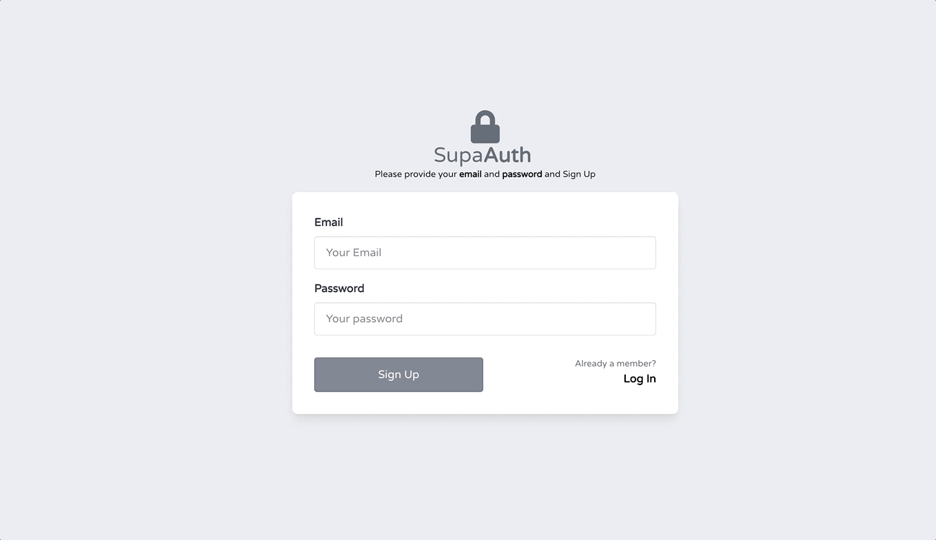
Once set up, the default landing page should look like

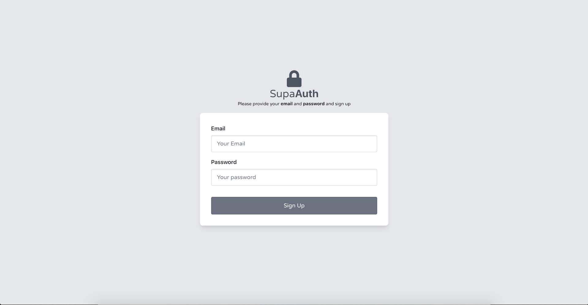
Create The Sign-Up Page
Maintain the Sign-Up Form's State
Your Mark-up's ready and the design's looking okay. You'll need a way to manage the form's state now, that can later be used to sign-up your users. The de-facto way of doing this in React is to use controlled form fields. Through the controlled form fields, you own
- controlling the values that form elements are populated with
- taking the updated values through change events and retain the values
You create a type of wiring, that binds individual form fields to the values their display and change reflection is controlled by.
When it comes to managing forms, there are many libraries you can choose like formik and react-hooks-form to make your job of managing form state more manageable. But, simple needs, seek a simple solution. As our app won't demand too many avenues for user input, we'll try to keep it simple.
Let's create a simple utility to maintain a form's local state and provide handlers to update it in a managed way.
Create a utils.ts file inside the src/lib directory and place the following code
import { useState } from 'react'

export function useFormFields<T>(initialValues: T): [T, (event: React.ChangeEvent<HTMLInputElement>) => void] {
    const [values, setValues] = useState<T>(initialValues)
    const handleChange = (event: React.ChangeEvent<HTMLInputElement>) => {
      event.persist();
      const { target } = event;
      const { name, value } = target;
      setValues({ ...values, [name]: value })
    }
    return [ values, handleChange]
}
You've created a re-usable useFormFields hook above that can be used with any form to keep the values that all of its fields share. Since the email and password are just input fields this will work just fine. For other fields like a radio or a checkbox, this hook can always be revisited, and you can check the target's type and act accordingly. T is a generic type that any form consumer can use like useFormFields<FormFieldProps>(INITIAL_FORM_STATE) to declare the shape of the data it maintains. We're getting strong type safety for form values, in a construct that will be re-usable across registration, logins, or for any such purposes.
Let's import useFormFields and apply it to the sign-up page's markup
import { NextAppPageProps } from '~/types/app'
import Layout from '~/components/Layout'
import { useMessage } from '~/lib/message'
import { useFormFields } from '~/lib/utils'

// define the shape of the SignUp form's fields
type SignUpFieldProps = {
  email: string,
  password: string
}

// the value we'd like to initialize the SignUp form with
const FORM_VALUES: SignUpFieldProps = {
  email: '',
  password: ''
}

const IndexPage: NextPage<NextAppPageProps> = ({}) => {
  const { handleMessage } = useMessage()

  const [values, handleChange ] = useFormFields<SignUpFieldProps>(FORM_VALUES)

  return (
    <Layout useBackdrop={true} usePadding={false}>
          <div>
            <input
              id="email"
              {{ /* Email field's markup (unchanged) */ }}
              value={values.email}
              onChange={handleChange}
             />
              {{ /* The following code (unchanged) */ }}
          <input
              id="password"
              {{ /* Password field's markup (unchanged) */ }}
              value={values.password}
              onChange={handleChange}
            />
          </div>
            {{ /* The following code (unchanged) */ }}
           <button
            onClick={(evt) => {
              evt.preventDefault()
              handleMessage({ message: `will sign up with ${values.email}`})
            }}
            >
              Sign Up
            </div>
           {{ /* The following code (unchanged) */ }}
  </Layout>
 )
}
Maintain sign-up form's data using a custom hook
You're ready with a good foundational structure to talk with Supabase's authentication layer now. Now, comes the part you've been waiting for.
All the authentication functions in Supabase exist under the supabase.auth namespace. You get dedicated methods for signing up, signing in, password reset, and all the similar functions.
Let's meet the first of the authentication functions Supbase has to offer.
Sign Up
With Supabase, Signing up is as simple as invoking signUp on the supabase.auth namespace
// Basic
const { user, session, error } = await supabase.auth.signUp({
  email: 'example@email.com',
  password: 'example-password',
})
Once a user signs up she's sent a confirmation email. Your users can then click the mail received in their inbox to activate their accounts and get redirected to the URL where your app's hosted. Let's go ahead and integrate the auth.signUp function.
Let's pull in the supabase client and few other things to plug the sign-up method to the SignUp form we created earlier. We'll create a wrapper function around supabase.signUp which will take the email and the password field, call Supabase with those details and show the success or failure of the operation.
import { useState } from 'react'
/* all the imports from above unchanged */
import { supabase } from '~/lib/supabase'
import Spinner from '~/components/Spinner'

/* all the pre-existing code */
type SupabaseSignupPayload = SignUpFieldProps // type alias

/* all the pre-existing code */

const IndexPage: NextPage<NextAppPageProps> = ({}) => {
  const [loading, setLoading] = useState(false)
 /* all the pre-existing code */
 // sign-up a user with provided details
  const signUp = async (payload: SupabaseSignupPayload) => {
    try {
      setLoading(true)
      const { error } = await supabase.auth.signUp(payload)
      if (error) {
        handleMessage({ message: error.message, type: 'error' })
      }
      else {
        handleMessage({ message: 'Signup successful. Please check your inbox for a confirmation email!', type: 'success' })
      }
    } catch (error) {
      handleMessage({ message: error.error_description || error, type: 'error' })
    } finally {
      setLoading(false)
    }
  }

  // Form submit handler to call the above function
  const handleSumbit = (event: React.FormEvent) => {
    event.preventDefault()
    signUp(values)
  }

  return (
    <Layout useBackdrop={true} usePadding={false}>
      {{ /* all the previous code unchanged */ }}
      <form className="w-full sm:w-1/2 xl:w-1/3" onSubmit={handleSumbit}>
        {{ /* all the previous code unchanged */ }}
            <button type="submit" disabled={loading} className="flex-1 bg-gray-500 border border-gray-600 text-white py-3 rounded w-full text-center shadow">
              Sign Up
            </button>
          </div>
          </div>
        </form>
        <div className="h-12 w-12 relative">{loading && <Spinner/>}</div>
      </div>
    </Layout>
  )
}
{{ /* all the previous code unchanged */ }}
Add support for Sign-Up with messaging
Your SignUp component is plugged into Supabase now. You've taken the form's data and sent it to Supabase through the supabase.auth.signUp(payload). Besides signing up your users you're doing a bit of housekeeping to
- give a visual cue indicating an in-flight Supabase request through a
loadingstate - handle the errors that are returned by Supabase, as well as the errors that could be produced by other factors
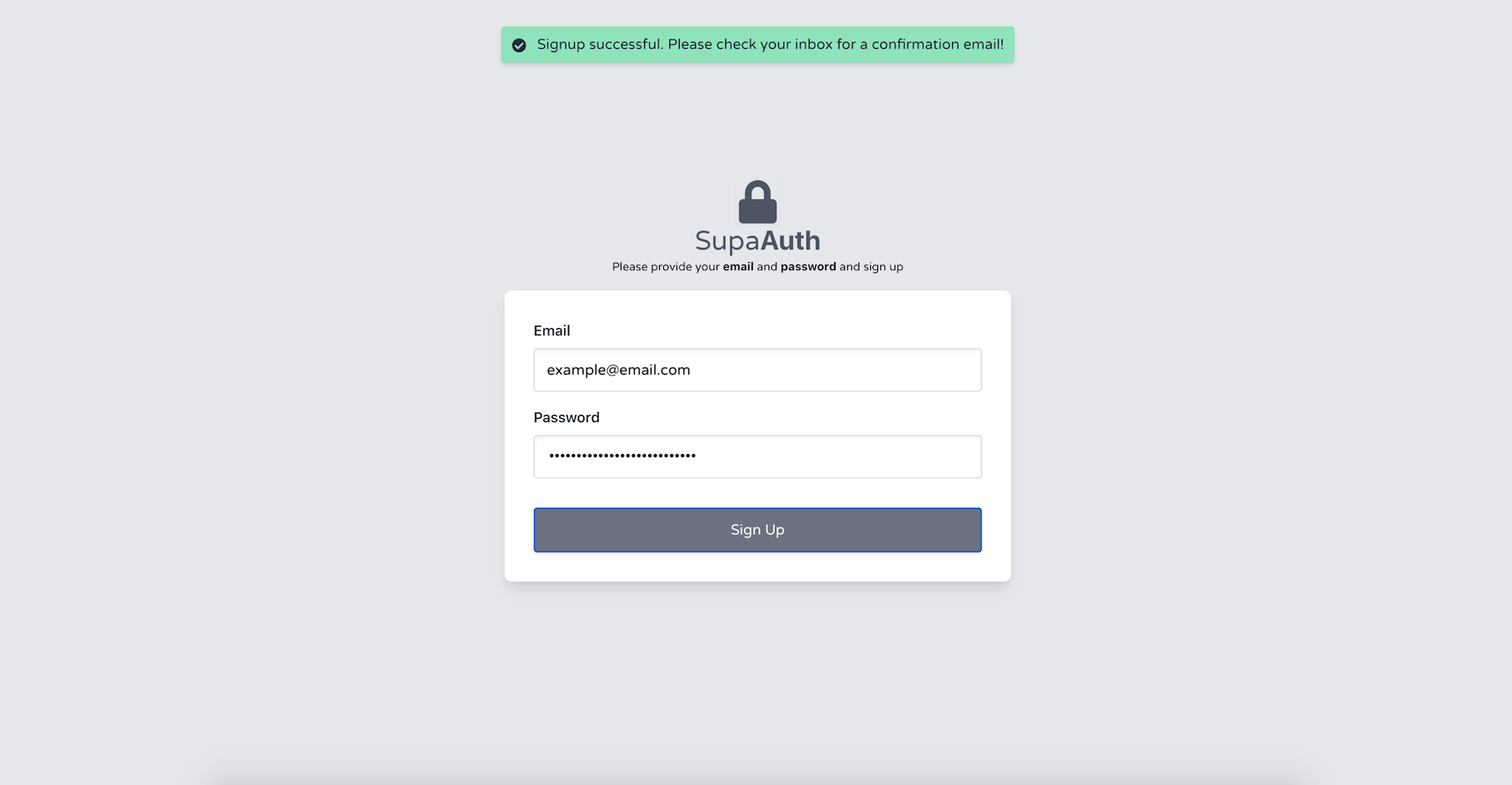
On a successful sign-up, your users should see a message like Signup successful. Please check your inbox for a confirmation email! in the UI.
A confirmation email is also sent on the provided email
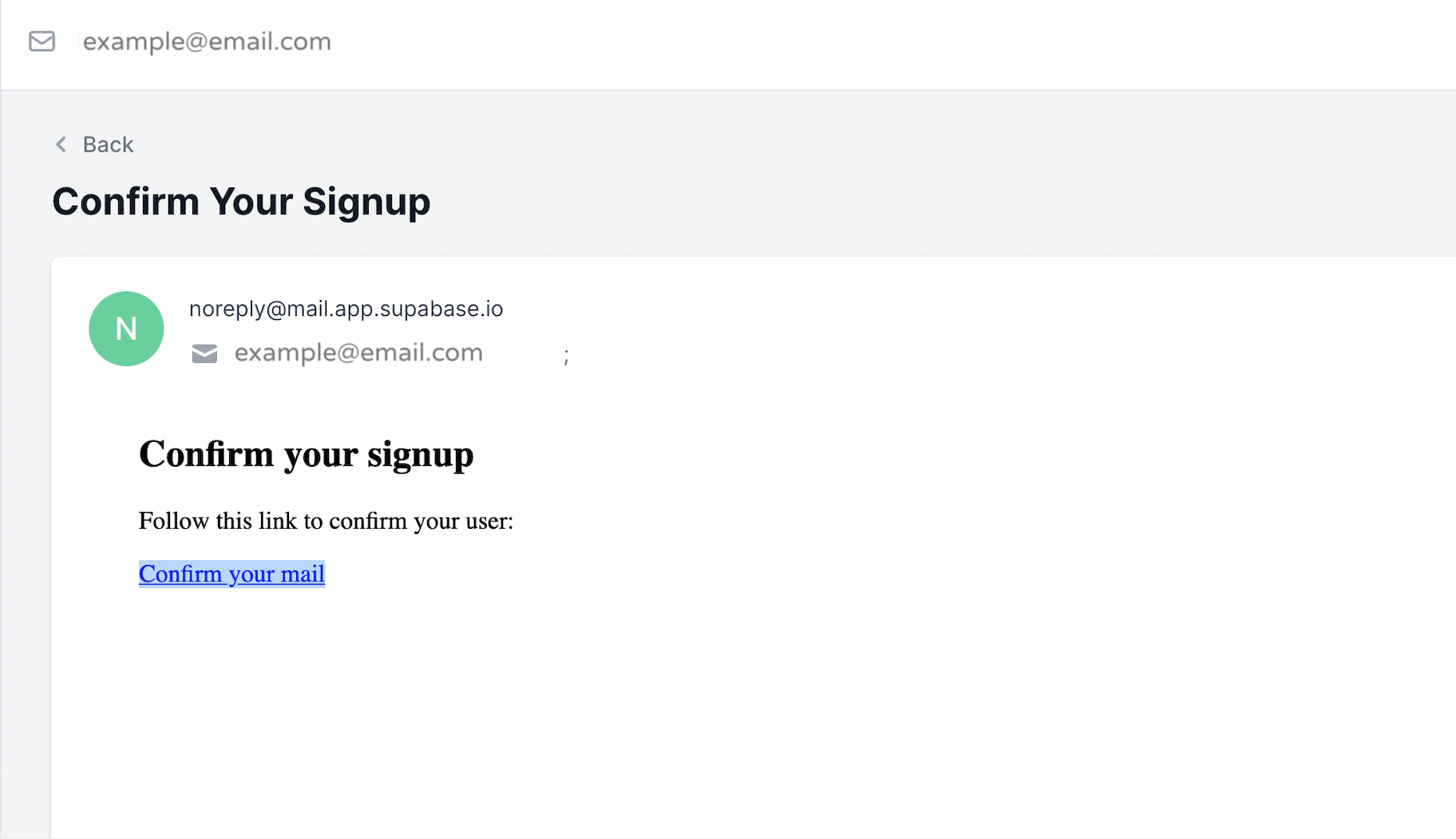
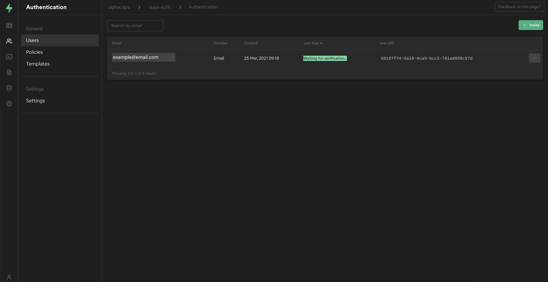
It's necessary to confirm the email to complete the registration process. The user remains unverified till it's not done.
The confirmation email once clicked leads your users to http://localhost:3000 by default. That's one of the Supabase's sensible defaults and is easily changeable under Authentication → Settings in your app.supabase.io project's settings.
If you'd try to re-use a registered email, you should see something like

Although you're not using it post-signup yet, supabase.auth.signUp(payload) also returns a user object of type User
interface User {
    id: string;
    app_metadata: /* retracted */;
    user_metadata: {
        /* non-frequent user related values */
    };
    aud: string;
    confirmation_sent_at?: string;
    email?: string;
    created_at: string;
    confirmed_at?: string;
    last_sign_in_at?: string;
    role?: string;
    updated_at?: string;
}
and a session object of type Session
interface Session {
    provider_token?: string | null;
    access_token: string;
    expires_in: number;
    refresh_token: string;
    token_type: string;
    user: User;
}
Both of these values, are more significant when a user signs in. The session value returned is null till an e-mail is confirmed.
Signing in your users
Your signUp function is validated to be working fine. Your users can easily sign-up now. But, we're not doing anything with the information that a user has signed up with yet. Let's complement the signUp method with a signIn method that will let your user login using the details they've registered with.
The signIn also follows a similar pattern, and return the very same user, session, and error object
const { user, session, error } = await supabase.auth.signIn({
  email: 'example@email.com',
  password: 'example-password',
})
Let's create a method for allowing our users to sign-in
Since signUp and signIn both take identical payload, we'll rename the type SupabaseSignUpPayload → SupabaseAuthPayload
type SupabaseAuthPayload = SignUpFieldProps
Change the sign-up method to accept the updated type
// unchanged code
const signUp = async (payload: SupabaseAuthPayload) => {
// unchanged code
Since the signIn method also works somewhat similarly, we'll create a bit similar function to allow sign in
const signIn = async (payload: SupabaseAuthPayload) => {
    try {
      setLoading(true)
      const { error } = await supabase.auth.signIn(payload)
      if (error) {
        handleMessage({ message: error.message, type: 'error' })
      } else {
        handleMessage({ message: 'Log in successful. I\'ll redirect you once I\'m done', type: 'success' })
      }
    } catch (error) {
      handleMessage({ message: error.error_description || error, type: 'error' })
    } finally {
      setLoading(false)
    }
}
You now have a function ready to allow for sign-ins too.
But, did you notice? we don't have a Sign-in UI yet. Where should we let the users provide the sign-in details?
Let's do one smart(or lazy) thing to get to the results quickly. Let's tweak the sign-up component's UI a bit to allow for both sign-up and sign-in.
To support that we'll add a new local state isSignIn. Let's go ahead and add it within the component
const [isSignIn, setIsSignIn] = useState(true)
and make necessary changes to all of the copies, functions that were just too much sign-up-centric.
const handleSumbit = (event: React.FormEvent) => {
    event.preventDefault()
   isSignIn ? signIn(values) : signUp(values)
}
The copy below the faux logo
<small>Please provide your <strong>email</strong> and <strong>password</strong> and {isSignIn ? 'Log In' : 'Sign Up' }</small>
and the code responsible for rendering the button
{/* Sign Up & Sign In form: Actions */}

  <div className="flex pt-4 gap-2">
    <button type="submit" className="flex-1 bg-gray-500 border border-gray-600 text-white py-3 rounded w-full text-center shadow">
       {isSignIn ? 'Log In' : 'Sign Up'}
    </button>
    <div className="flex-1 text-right">
       <small className="block text-gray-600">{isSignIn ? 'Not a member yet?' : 'Already a member?'} </small>
        <a className="block font-semibold" href=""
        onClick={(e) => {
            e.preventDefault()
          setIsSignIn(!isSignIn)
        }}
        >{isSignIn ?  'Sign Up' : 'Log In' }</a>
    </div>
Add support for Sign-In with messaging
With all of the above changes in place, you'll have a dual-purpose form to allow for both sign-up and sign-in. Let's see if our changes work.
Oh, they do work! Congratulations!
Our users will now be able to sign-up as well as sign in. Try the details you've used to register any users, and you should be able to see something like
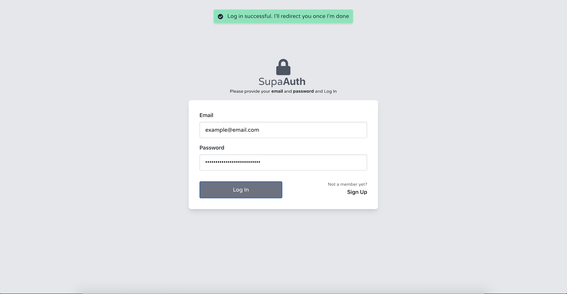
confirming the success of the login operation. You'll also get an error message indicating the failure of your attempt if you provide any wrong details.
Where to go from here?
At this point, If you wanna take Supabase's other authentication methods for a spin there are other cool things you can do like
- Magic link — You can make the password field optional and Supabase will take care of sending the magic link to the provided email which we can use to login password-less
- Sign in through 3rd Party providers — You can re-factor the sign method to accept a provider property to allow for login through 3rd party providers like Github, Facebook, Azure, etc.
If not, half of the auth journey is still uncharted.
We've put a good gatekeeper at our app's door now but the app's still empty. Our authenticated users must get access to some app area they're privileged to view and non-authenticated users must be restricted from viewing this very same place.
The code also seems to be very noisy with too many things happening within a single component — types, states, and functions spread all over. Definitely, not a recipe for re-usability and long-term maintainability.
So be tuned in, we'll cover that and more in the next few articles.
Thank you for being till the end 🙌 . If you enjoyed this article, or learned something new, please take a second to tweet this article or share on LinkedIn so others can discover it. Or add to the discussion on Twitter.