SERIES: Learn Astro while building Ink #4
Astro & Interactivity - Bring your Site to Life


12 min read • –––


You're on part 4 of the 5-part series Learn Astro while building Ink where you'll build a blog(Ink) using astro.build, one of the most promising static/JAM Stack site builder today!
Astro & Interactivity - Bring your Site to Life
Astro(.astro) components are supposed to be rendered statically to string/HTML. They natively or directly cannot support interactivity or client-side/user-oriented behavior. Anything that has anything to do with interactivity - carousels, accordion, AJAX-based forms, and remote data-driven panels, you won't be able to achieve purely with *.astro files.
This constraint is important, as well as necessary
- For fine-grained control over a component initialization process,
- Introduce interactivity
- Not be interactive by default, but delegate it to the more mature set of tools, specialized and exceptionally well at it, and
- Do things that have no parallel when a methodology of outputting HTML is at play(
.astro)
.astro wants to ship less to no JS by default, and as long as you stick with the format, you'll get what it promises.
You get the promise - Ship less JS by default now? :-)
So, how can you do it?
If you need interactivity - You can rely on your good friends from the UI ecosystem like React, Svelte, and Vue (even Web Components).
Using components from the other UI Frameworks.
Astro is all ready to embrace .jsx, .vue, .svelte files, but considering that you'll always need either one or all of them isn't a decision that should stay with your SSG Framework. Astro lets you enable, the framework of your choice through a compile-time, framework-agnostic constructs called Renderers. Renederes for React, Vue, Svelte, etc. ship by default and can be enabled using the renderers key in astro.config.mjs file. For example, if you'll have Svelte components alongside Astro files, you can enable it by adding the following line in astro.config.mjs
  //
  renderers: [
    '@astrojs/renderer-svelte',
  ]
Similarly, React, Vue, and Preact doesn't require any external modules to be installed and can be enabled simply by adding one or all of the following config
export default {
  renderers: [
    // Add the framework renderers that you want to enable for your project.
    // If you set an empty array here, no UI frameworks will work.
    //  '@astrojs/renderer-svelte',
    //  '@astrojs/renderer-vue',
    //  '@astrojs/renderer-react',
    //  '@astrojs/renderer-preact',
  ],
};
So, What renderers precisely do?
Your Framework specific renderers are supposed to perform two duties
- render a component to a static string of HTML at build time
- rehydrate that HTML to create an interactive component on the client. (we'll learn this soon)
For frameworks or needs outside the supported list of Frameworks(or Web Components), the config could be customized as -
export default {
  renderers: ['my-custom-renderer'],
};
Coding Time
Since this article is about interactivity, we'll create something interactive, but we'd try something simple enough to demonstrate the concept. How about a theme switcher? A button on the client-side that can change the theme for our site?
Choose the Framework
We'll choose Svelte as our framework due to the following reasons
- It's light-weight, and has one of the lowest framework size/runtime cost amongst the known/popular frameworks
- the syntax does not takes you away too far from HTML and native JavaScript, plus
Svelte feels like a close cousin to Astro, with constructs like
- Single File Components (script, HTML, style) all in the same File
<slot/>works just as it works in the*.astrofilesTrivia - Some of the initial work on Astro took its inspiration from Svelte. At one point, props also worked as they work in Svelte today.
Make Astro aware of Svelte
Let's enable the svelte renderer as shown before.
export default {
  renderers: [
    '@astrojs/renderer-svelte',
  ],
};
Create a non-Astro(Svelte) component
the ModeSwitcher Svelte component (src/components/ModeSwitcher.svelte) we want to create will
- maintain two string values of
ThemeType-darkandlightto recognize the theme to be enabled for the site - maintain the current theme in a local variable
currThemeand inlocalStorageto support reloads and re-visits - initialize/apply the theme when the page is loaded
- switch the theme with
onClickof a button - Keep a
<slot/>so that users can control the layout/style of the button that will let them toggle the theme (Headless, aye?)
<script lang="ts">
    import { onMount } from 'svelte'

    type ThemeType = 'dark' | 'light'

    const THEME_DARK: ThemeType =  'dark'
    const THEME_LIGHT: ThemeType =  'light'

    // Current theme
    let currTheme: ThemeType = THEME_DARK

    // Toggle the default theme
    function toggleTheme() {
        window.document.body.classList.toggle(THEME_DARK)
        currTheme = localStorage.getItem('theme') === THEME_DARK ? THEME_LIGHT : THEME_DARK
        localStorage.setItem('theme', currTheme)
    }

    // Apply the theme on load
    onMount(() => {
        if (localStorage.getItem('theme') === THEME_DARK || (!('theme' in localStorage) && window.matchMedia(`(prefers-color-scheme: ${THEME_DARK})`).matches)) {
            window.document.body.classList.add(THEME_DARK)
            currTheme = THEME_DARK
        } else {
            window.document.body.classList.remove(THEME_DARK)
            currTheme = THEME_LIGHT
        }
    })
</script>
<button on:click={toggleTheme}>
    <slot theme={currTheme}/>
</button>
Include the component
Open src/components/Header.astro file and use the component created above
---
    import { SITE } from '$/config'
    import SvgIcon from './SvgIcon.astro'
    import ModeSwitcher from './ModeSwitcher.svelte' // here!
---
place it after the Github list item
    <li>
        <ModeSwitcher client:visible>
            <!-- place your button: <button>switch mode</button> here if not using the <SvgIcon />-->
            <SvgIcon>
                <circle cx="12" cy="12" r="5"></circle>
                <line x1="12" y1="1" x2="12" y2="3"></line>
                <line x1="12" y1="21" x2="12" y2="23"></line>
                <line x1="4.22" y1="4.22" x2="5.64" y2="5.64"></line>
                <line x1="18.36" y1="18.36" x2="19.78" y2="19.78"></line>
                <line x1="1" y1="12" x2="3" y2="12"></line>
                <line x1="21" y1="12" x2="23" y2="12"></line>
                <line x1="4.22" y1="19.78" x2="5.64" y2="18.36"></line>
                <line x1="18.36" y1="5.64" x2="19.78" y2="4.22"></line>
            </SvgIcon>
        </ModeSwitcher>
    </li>
You can place just a label, button, or HTML inline-able item, where I've put the SvgIcon component and its content(which renders a sun icon).
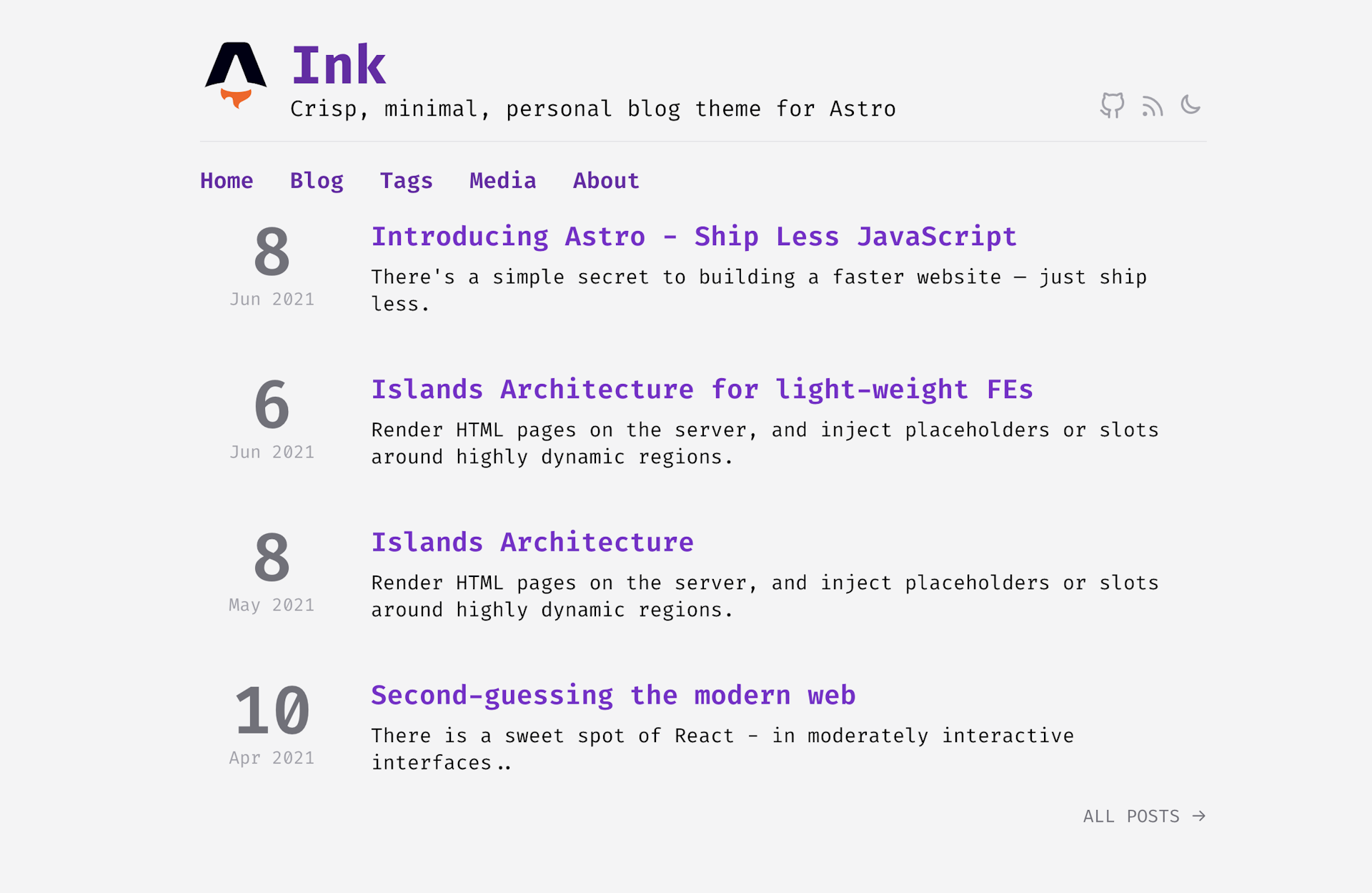
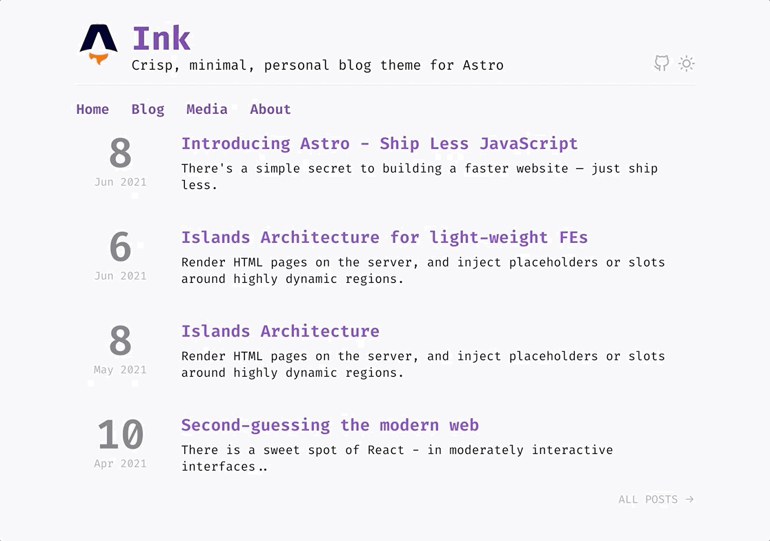
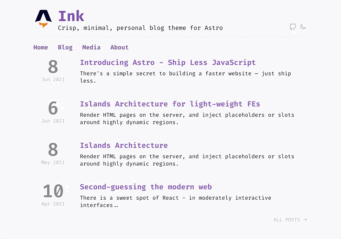
See it in Action!
Open the page, and see your Svelte component in action. You'd see the default theme applied. Try pressing the icon, and see if the light theme is traded out for a dark theme.

It didn't work? How come it didn't work? Let's revisit the two things renderers are capable of doing.
- render a component to a static string of HTML at build time
- rehydrate that HTML to create an interactive component on the client.
The pt. 1 is the default behavior for even your interactive components, which is in line with how Astro works. By that rule, your Svelte component produced just a visual and a non-interactive piece of mark-up. But you needed interactivity, and renderers enable it too, so why it didn't work?
It's because - without the right hints, Astro couldn't recognize that your components need hydration.
So how could you provide that hint?
Let's see...
Controlling Hydration
Astro, let's you code in a framework/library you already know and still eventually produce zero-client-side JS by default coz statically rendered components very hardly need too much interactivity. But for many things other than content experience, interactivity and client-side JS is something you always gonna need to connect with 3rd party services for authentication, persistence, mailers, etc. For such needs, Astro lets you partially hydrate components. So, if your component has interactivity you can use client:when hooks events to initialize your components.
Here's how you can control the hydration.
<MyComponent />``` - will render an HTML-only version of MyComponent (default)
<MyComponent:load /> will render MyComponent on page load
<MyComponent:idle /> will use requestIdleCallback() to render MyComponent as soon as main thread is free
<MyComponent:visible /> will use an IntersectionObserver to render MyComponent when the element enters the viewport
<MyComponent:MediaQuery /> will hydrate when the media query consition matches
For our ModeSwitcher.svelte compoonent all it needs is a client:visible hint
    <li>
        <ModeSwitcher client:visible>
            <SvgIcon>
               <!-- prev code unchanged -->
            </SvgIcon>
        </ModeSwitcher>
    </li>
Now, play with the ModeSwitcher, and the Svelte component should work as expected.
feat(4.1): Interactivity and Hydration
So, Where should I draw the line?
Unlike UI framework-based SSG solutions, you don't have the concept of one single framework controlling the client-side experience for routing, data-driven, and interactive components by default. You choose what you want and exactly when you want it. That's one of the core tenets that help Astro ship no-js by default. Your every page is stand-alone, not stitched by a routing solution but relying purely on static linking. But, this is not a limitation. You can still mount a UI framework, or routing solution on individual pages, by hydrating correctly.
For our ModeSwitcher.svelte component, you can see it's working just fine. All the behavior is encapsulated and kicks in on hydration and then later owned by the UI framework of choice itself. But what if you need Astro to not just place/inject static components within a Svelte component? What if you need the SVGIcons to react based on the current internal state of the ModeSwitcher? A sun icon when you're in dark mode, and a moon icon where you're in the light mode to facilitate the next toggleable state? You cannot do it in its current make. Though ModeSwitcher.svelte passes the current theme like
<slot theme={currTheme}/>
you cannot effectively use
<ModeSwitcher client:visible let:theme>
The client:when hint, is not just an opt-in interactivity marker, it's also the boundary beyond which, only a FE framework is expected to operate, and before which it's Astro's all-static realm. If you need the button's state to change, you'll have to increase the scope of interactivity, by creating more interactive components, that can encapsulate the inner interactive children.
It means that we'll have to create a Svelte button, to hold both the sun/moon(icon)'s state dynamically. Let's create a SvgIcon.svelte.
<svg xmlns="http://www.w3.org/2000/svg" width="24" height="24" viewBox="0 0 24 24" fill="none" stroke="currentColor" stroke-width="2" stroke-linecap="round" stroke-linejoin="round">
    <slot/>
</svg>
same as SvgIcon.astro, but mean for Svelte consumption. You can just duplicate SvgIcon.astro and rename it to SvgIcon.svelte. No change is necessary, as it isn't using anything unique to Svelte only(one of the reasons Svelte is a good match with Astro)
And a Svelte component to encapsulate their toggle-able markup
<script lang="ts">
    import ModeSwitcher from './ModeSwitcher.svelte'
    import SvgIcon from './SvgIcon.svelte'
</script>
<ModeSwitcher let:theme>
    <SvgIcon>
        {#if theme === 'dark'}
            <circle cx="12" cy="12" r="5"></circle>
            <line x1="12" y1="1" x2="12" y2="3"></line>
            <line x1="12" y1="21" x2="12" y2="23"></line>
            <line x1="4.22" y1="4.22" x2="5.64" y2="5.64"></line>
            <line x1="18.36" y1="18.36" x2="19.78" y2="19.78"></line>
            <line x1="1" y1="12" x2="3" y2="12"></line>
            <line x1="21" y1="12" x2="23" y2="12"></line>
            <line x1="4.22" y1="19.78" x2="5.64" y2="18.36"></line>
            <line x1="18.36" y1="5.64" x2="19.78" y2="4.22"></line>
        {:else}
            <path d="M17.293 13.293A8 8 0 016.707 2.707a8.001 8.001 0 1010.586 10.586z"></path>
        {/if}
    </SvgIcon>
</ModeSwitcher>
with the above changes the full-circle of interactive boundary is complete now. In src/components/Header.astro import ModeSwitcherBtn.svelte instead of `ModeSwitcher.svelte'
---
    import { SITE } from '$/config'
    import SvgIcon from './SvgIcon.astro'
    import ModeSwitcherBtn from './ModeSwitcherBtn.svelte' // here, ModeSwitcher out!
---
and replace
<ModeSwitcher client:visible>
with
<ModeSwitcherBtn client:visible />
You can see the ThemeSwitcher work just fine.
feat(4.2): Encpasulate behaviour within component types
Local App State with stores
What we've done thus far can take care of components that are descendants and fall in the same, continuous, Svelte-managed tree. What if we want the state in other places?
Store to the rescue!
You can freely change a writable svelte store, and Svelte components somewhere else can easily subscribe to it and react accordingly.
Let's create a central theme store at src/store/theme.ts
import { writable } from 'svelte/store'
type ThemeType = 'dark' | 'light'

export const theme = writable<ThemeType>('dark')
and update it in our toggle functions inside ModeSwitcher.svelte
<script lang="ts">
    // pre-existing code
    import { theme } from '../store/theme'

    function toggleTheme() {
        // pre-existing code
        // Update Store
        theme.set(currTheme)
    }
    onMount(() => {
        // pre-existing code
        theme.set(currTheme)
    })
</script>
// pre-existing code
To expose the theme more conveniently and independent of Button, let's create a provider component
<script lang="ts">
    import { theme } from '../store/theme'
</script>
{#if $theme === 'dark'}
    <slot name="dark"/>
{:else}
    <slot name="light"/>
{/if}
Now let's say from the usage point-of-view we want to display the current theme in the site's footer. To serve that purpose, let's create a component that will use the store value.
<script lang="ts">
    import ModeSensitive from './ModeSensitive.svelte'
</script>
<ModeSensitive>
    <span slot="dark">(dark)</span>
    <span slot="light">(light)</span>
</ModeSensitive>
Imports the provider component, and display the currently selected theme. <ModeSensitive/> will render <span slot="dark">(dark)</span> for dark theme, and <span slot="light">(light)</span> for the light theme.
With both the Provider/Consumer components orchestrated to produces and consume, the consumer can be placed and hydrated anywhere independently on the page. For us, it's the footer!
---
    import { SITE } from '$/config'
    import ModeLabel from './ModeLabel.svelte'
---
<div class="footer">
<nav class="nav">
<div>2021 © Copyright notice | <a href={ SITE.githubUrl } title={`${ SITE.name }'s Github URL'`}>{ SITE.name }</a> theme on <a href="https://astro.build/">Astro</a></div>
<ModeLabel client:load/> theme on <a href="https://astro.build/">Astro</a></div>
</nav>
</div>
<!-- pre-existing code -->
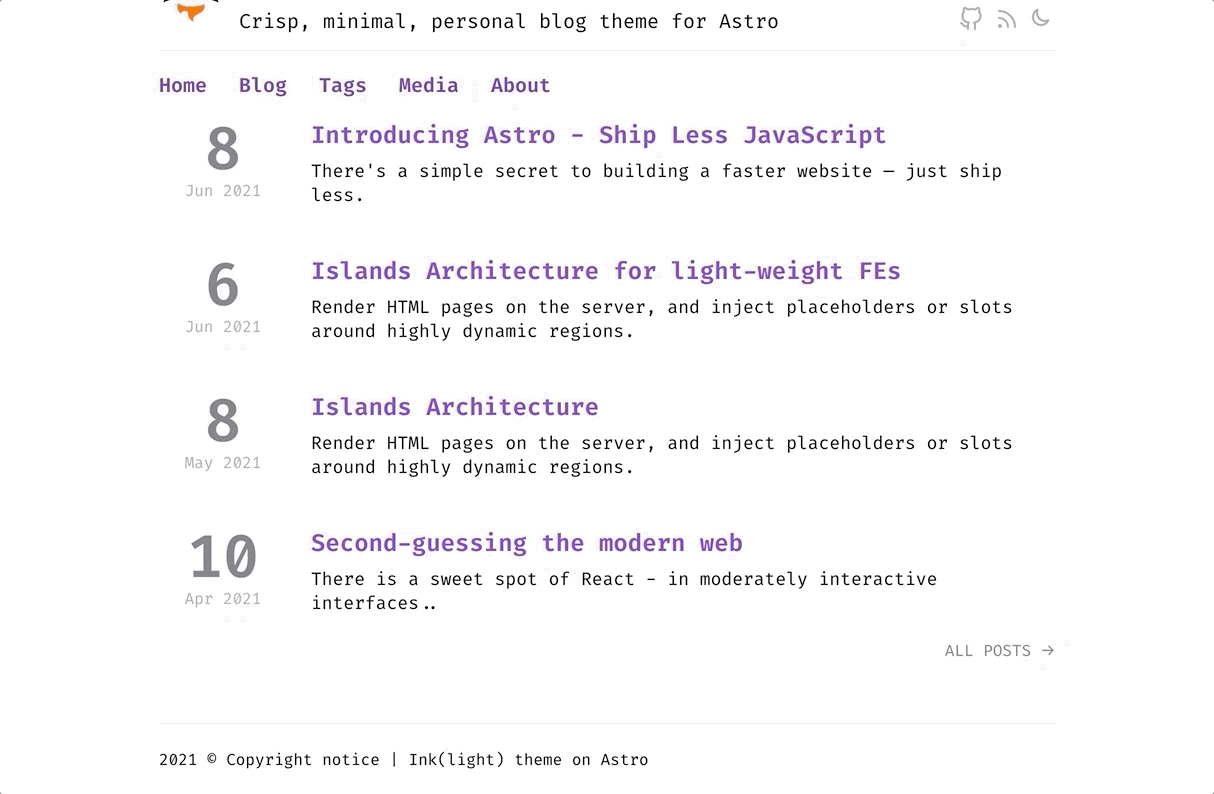
Check the footer's label adapting to the current theme
feat(4.3): Common store for svelte
If you want you can further re-factor the
ThemeSwitcherto use the above store instead of maintaining a local state
Conclusion
Equipped with the knowledge of how to introduce interactivity in the Astro components - You can now enable more renders for other things, replicate what we've done here with React or Vue, and pour in all sorts of client-side behavior in the Astro site you build.
Have we left something un-covered?. Could you recall something else SSG sites must do?
Yes, we did miss a very integral part. Our approach to page generation has been pretty manual and involved in part-2 and part-3 of this series.
So, how can we generate entire pages(with their routes) dynamically?
Let's discover that and more in the upcoming article.
More Resources
Thank you for being till the end 🙌 . If you enjoyed this article, or learned something new, please take a second to tweet this article or share on LinkedIn so others can discover it. Or add to the discussion on Twitter.